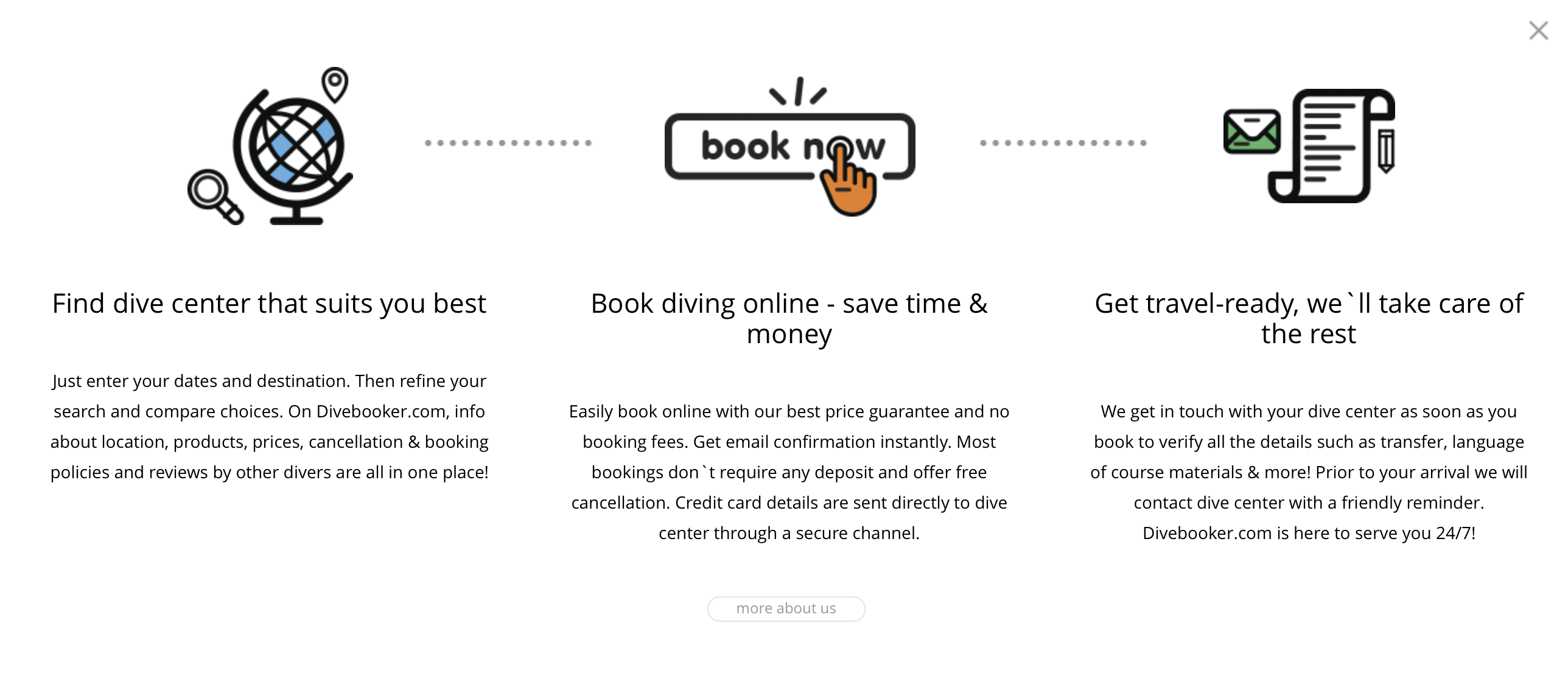
Divebooker.com is a travel search engine, similar to Hotels.com, Expedia.com and many others. But where other sites cater to the general traveling public, Divebooker.com focuses exclusively on dive travel. Right from the start, I got the sense that this might be an expensive acquaintance for me.

First impressions

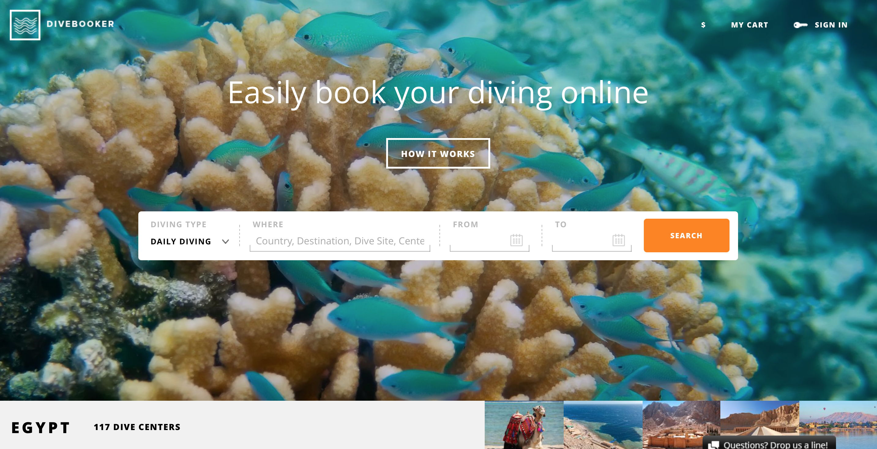
The site’s got a clean design. A search bar dominates the top part of the screen, with dive-themed photos as the background. Here, you enter your destination of choice, when you want to travel, and how many people are traveling. The search engine then returns a selection of dive centers in the area that have available offers for that time. Below the search bar is a list of available countries where the service has registered dive centers, and you can click each country to browse through the dive locations and centers manually. This is very well suited for gathering inspiration for where to go on your next dive vacation. (And this where the service can become seriously detrimental to your bank account.)
Types of diving
The search bar also allows you to specify what type of diving you’re interested in — daily diving/pleasure diving, tech diving or dive courses. The centers you’re presented with will fit your criteria, so if you’re specifically asking for tech diving, you won’t be shown any dive centers that do not offer it. However, when you go to the actual dive center’s details, their offerings aren’t filtered, so you’ll be shown pleasure diving, dive courses, and tech diving (typically in that order). On my first couple of tries, I thought that there was some mistake and the dive center I’d chosen didn’t actually offer tech diving.
Unfortunately, the search function requires you to enter all your information before it will return results, so it’s impossible to search for a given time slot (i.e. your vacation) and see what countries have dive centers with available offers at that time. Likewise, you cannot leave the date range open while searching for a country to see when would be the best time to travel.
Dive results page
Once you’ve made your search, you’ll be presented with list of results. If you’ve got too many to chose from, you can filter the list for things such as language, dive-training organization, and other factors that are important to you. Once you click on one of the centers, you’re presented with photos, their offerings, location, price list and rating, based on other users of divebooker.com.
Dive centers only
Although the exclusive focus on dive travel is helpful in some regards, the site would be far more useful if it allowed you to search for, and book, travel arrangements and accommodations as well as dive activities. Focusing only on dive centers means you can book all of your diving and courses for your vacation, but you’ll need to go somewhere else to book flights and accommodation. This forces you to juggle several web sites at once to ensure that your diving fits in with your flights and your hotel’s location. That being said, the site does state whether a given dive center offers transport or pick up, and from which hotels, but this is only relevant once you’ve arranged travel to and accommodation at your chosen location. An ideal solution would be collaboration with one of the big travel booking sites, so divebooker.com could truly become a dive vacation one-stop-shop.
Price comparison
I did a few comparisons to see if there was any difference between a dive center’s prices found on divebooker.com and on the center’s own web site, and found none. One center offered a price of $51 per dive on divebooker.com, and €38 on its own site, a roughly equivalent price. So it would seem there’s no savings to be had from booking this way, but no additional cost, either. That means that using divebooker.com is primarily a matter of convenience: you can comparison shop all in one place, rather than clicking from one site to the next.
Getting help
Should they have any questions, the site offers users a chat function where they can talk to a support-staff member. When I used the site, the chat window seemed to open automatically, and the staffer initiated the chat every time, which seemed a bit distracting, if not pushy. I asked a question at one point, and it took a while for me to get an answer, but when I did, it was helpful. I would personally prefer to initiate the chat function, so that I could use it when I needed help, and leave it off until then.
Mobile
The site also works on mobile platforms, but unfortunately, it simply scales down the existing content, rather than making it responsive to a mobile screen. The interface becomes somewhat small and hard to read on a smaller phone screen, such as an iPhone. On larger screens, such as some of the larger Samsungs, or on tablets, there’s no problem reading it. A better mobile solution, or an app, would be ideal.
While there’s room for improvement, divebooker.com offers dedicated divers a service that is hard to find elsewhere: a search engine for finding dive centers and comparing prices and services across several facilities. All in all, I’m likely to use divebooker.com the next time I need to find a dive center when I’m traveling.

